When I started quilting I always intended to make a quilt in 1930’s reproduction prints. It’s only taken me 15 years to get there!
I usually gravitate to bright colors, and working with these more subdued prints was a bit of a challenge because they don’t pop in the same way as the fabrics I usually work with. That said, I love how this version of Sparkling Trail worked out!
The colors are better in person, and obviously this still needs to be quilted.
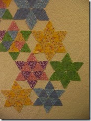
Initially I planned to make each star monochromatic. Even taking into account the poor late-night lighting in the picture below you can tell it looked a bit bland. I tried centers in one fabric and points in a matching fabric. I tried mixing points and centres.
In the end, I concluded that these 1930’s prints work best in truly scrappy mode.
That’s why I opted to make the border from small squares rather than longer scrap chunks as I have for other versions of this quilt.
Reaction in the household was mixed. Hubby loved it. He said it made him think of front porch swings in the summer and picket fences (not that we have any such things, but I know what he means). My son, on the other hand, commented on how these were not my usual fabrics and he wasn’t sure he’d like to look at them all the time. He’s a teen boy, of course he wouldn’t! His room is safe. The quilting of the black and bright kaleidoscope quilt for his bed is coming along.
Linking up with
Main Crush Monday at Cooking Up Quilts
Let’s Bee Social at Sew Fresh Quilts


I'm not a huge fan of 30's reproductions, but your quilt is great! I just love your design and the multi-colored stars.
ReplyDeleteSo fun to see this in other colors. I find myself drawn to the brighter colors too.
ReplyDeleteI like this quilt so much. I haven't seen a design like this before and it's really eye catching. The decision to make it scrappy was great, it looks so good! :) Thanks for linking up to MCM!
ReplyDeleteI am a bright color girl too, but this is really pretty! And interesting seeing the different layouts - I can't believe I am saying this but I agree - scrappy was definitely the way to go! I guess sometimes scrappy is good :) I agree with your husband, it does feel like front porch swings and white picket fences :)
ReplyDeleteI love it! I love the motion you created and the scrappiness. It is gorgeous!
ReplyDeletegreat job! I plan on making this one in 30's prints,too.Just gotta finish a few other UFO's first.. ,)
ReplyDeletePersonally, I prefer 1930 fabric mixed up. When there too much of the same colour in a spot, it always seems like it's missing something. Love yours!
ReplyDeleteI too think 30's work best when all mixed up. Your border is perfect for it. Should be a fun one to quilt!!
ReplyDeleteThis is beautiful; the fabrics are scrappily subdued but glow peacefully. This quilt is a gentle statement.
ReplyDeleteThe scrappiness is spot-on fabulous! Much better than a single color per star. I love the bold colors in your header and will be poking around here for some more of those.
ReplyDeleteLike you, thirties fabrics are not usually my favorite, but I do love them in your quilt! I have a lot of 30's left over from a BOM project a long time ago that I never finished. Maybe someday........Yours does give me inspiration. ---"Love"
ReplyDeleteThose are lovely fabrics and the scrappy version is definitely my favourite. A very pretty quilt indeed.
ReplyDeleteOkay, I'll admit it, my first reaction was "meh"... I'm on the fence about the 30's fabrics in general. Sometimes I love them, sometimes I don't. But then I kept reading and saw the matchy ones and then liked the final product much better. I still think I like the original of this pattern best, but having multiple options is always fun to see.
ReplyDeleteI like the final product. Showing your thought process in pictures is always interesting. I think I have a made a couple of things with reproductions...but that was years ago.
ReplyDeleteHappy Quilting!!
I like how you used the 30's prints in Sparkling Trail! Just the right mix!
ReplyDelete