Wednesday, September 29, 2021

Sneaky Sewing

Several weeks ago I went fabric shopping.  I had no Halloween décor for my home, so I enlisted my  friend and former coworker Amy, a huge Halloween fan, to help choose fabric for placemats to address that lack.

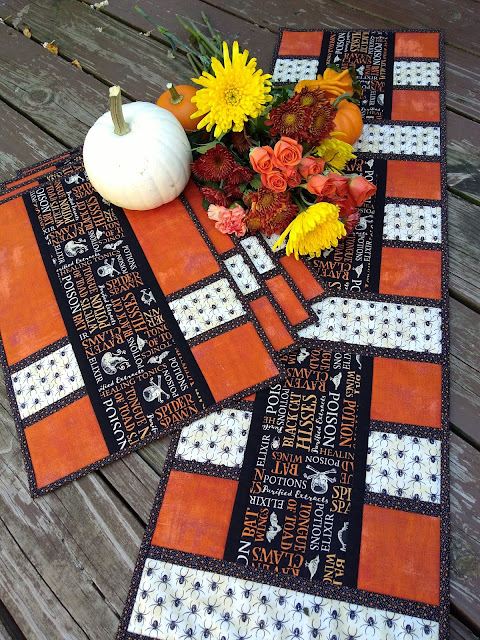
fabric:  orange, black with orange and cream Halloween text, cream with black spiders, black with tiny orange stars

Those spiders are a stretch for me.  Not a spider fan over here, despite knowing that they help control pests.  The color, scale and theme were right though, so I went with it.

Halloween patchwork using black, cream and orange prints
Halloween Fresh Wrapped placemats in progress

I chose to use my Fresh Wrapped pattern. There wasn't much cutting to do, as these are strip pieced, so the cutting and piecing were easily finished in one evening.  I then pondered what to quilt, and decided quilting in the ditch would be just fine.  The fabrics are the stars of the show in these, and since I was using Thermore for the batting,  I didn't need to quilt more densely than that.  Thermore is ideal for runners and placemats, as it has just enough loft to still show a bit of texture from quilting, but not so much loft that the surface is uneven and results in tipped beverage glasses. It also doesn't shrink, so paired with pre-washed fabric it results in a placemat that won't get too wonky after washing.

placemat sporting multiple binding clips, with a sewing machine
Binding Fresh Wrapped placemats

I think the binding took longer that the quilting.  Placemats are small, so it's easy to forget how much binding a table set needs.  This set has about 360".  That's 10 yards!  If you're wondering why I use so many clips, you can read all about it and the rest of my binding method here.  I've tried school glue instead of all those clips, but clearly I need to go back to kindergarten because I made a mess with the glue.  I'll stick with clips. 

Binding is rather boring, right up until it's finished.  When it's finished, I marvel at what difference the binding makes.


Fall flowers and mini pumpkins on a set of placemats and runner
Halloween version of Fresh Wrapped, by Canuck Quilter Designs

By now, I'm sure you're wondering why I titled this post "Sneaky Sewing".  Remember Amy, the Halloween fan?  Her local wedding reception was on Saturday, and this was her wedding gift.  Yup, I had her pick out her own gift without telling her that's what she was doing.  I sewed it in plain sight on Instagram and Facebook, too!

What is the sneakiest sewing you have ever done?

Saturday, September 18, 2021

Have you used a Jelly Roll lately?

 It's been a while since I used a jelly roll.  In fact, technically speaking, I'm not sure I have ever used an actual jelly roll, as that term is specific to Moda rolls of 2 1/2" precut strips.  I have, however, used other assorted packs of 2 1/2" strips.  I even have two strip-friendly patterns to revisit for National Sew a Jelly Roll Day today:  Sprinkled and Topiaries.

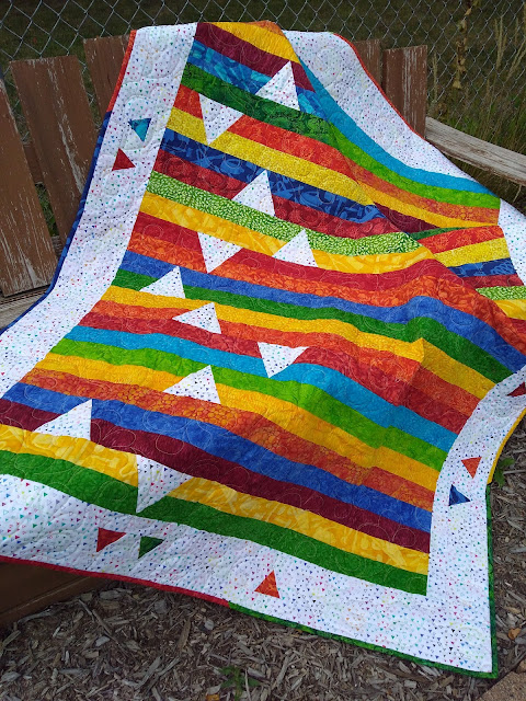
Quilt made of strips of bright colors, with inset accent triangles
Sprinkled, made by Theresa Peterson-Smith from the Canuck Quilter pattern

I just love this version of Sprinkled, made by my friend Theresa.  It's bright and happy and easy.  It keeps  the strips mostly intact and uses a simple cut-and-replace technique to add the sprinkling of triangles. The pattern uses 36 of the strips in a pack.  Some of those 36 strips are used for the little triangles in the border and for the binding.

My version used a strip pack of Shimmer from Northcott in a single colorway, for a more serene quilt.

Quilt made with assorted blue and aqua strips, with inset cream triangles
Sprinkled by Canuck Quilter Designs, using Northcott Shimmer strips


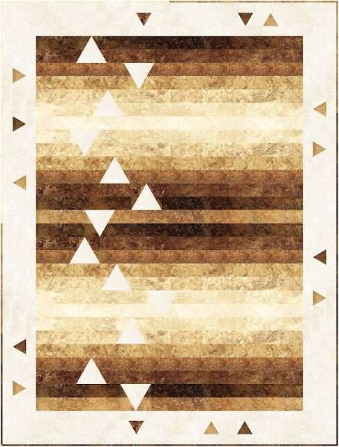
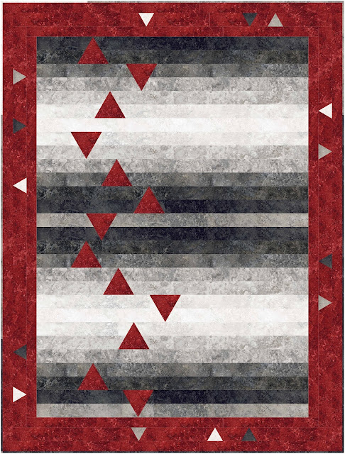
I recently played in EQ8 to recolor the quilt in Stonehenge Gradations fabrics.  The earth tones of the one below call to me as we head into fall, but the red and black below that one packs a punch and that's appealing too.

Precut-friendly strip quilt with inset triangle accents
Sprinkled by Canuck Quilter Designs, in Stonehenge Gradations Iron Ore


Quilt with black and grey precut strips with inset red accent triangles and a red border with inset triangles.
Sprinkled by Canuck Quilter Designs, in Stonehenge Gradations Graphite

My second pattern is Topiaries.

Quilt with blue border and octagons made of assorted blue precut strips, on a creamy gold background.
Topiaries by Canuck Quilter Designs

This one uses strip piecing and snowballed corners for quick assembly.  I want to make this again in florals, and in bright primary colors, and jewel tones...


So many options.  Unfortunately,  playing with these designs in EQ is about all I'm going to manage to mark Sew A Jelly Roll Day. I didn't plan ahead so I have no jelly rolls to use to sew along today, and I don't have any suitable yardage to reduce to 2 1/2" strips either.  My daughter borrowed the car to get to work, so heading out to the quilt shop is out.  

My only options are to (A) just enjoy browsing online to have a peek at what other jelly roll projects folks are working on today, or (B) forget the jelly rolls and go sew something else.

I'm going with what we call the Winnie the Pooh option*:  both!  What's under your needle today?


* For those who did not read and watch oodles of Winnie the Pooh as a child or with a child, Pooh Bear was offered "honey or butter on your bread" and replied "Both!"


Friday, September 10, 2021

Placemat problem?

I can't lie.  I'm developing a placemat problem.  I just made two more sets, I have fabric for a third, and I have firm plans to make yet another set once the fabric I want is out in stores. 

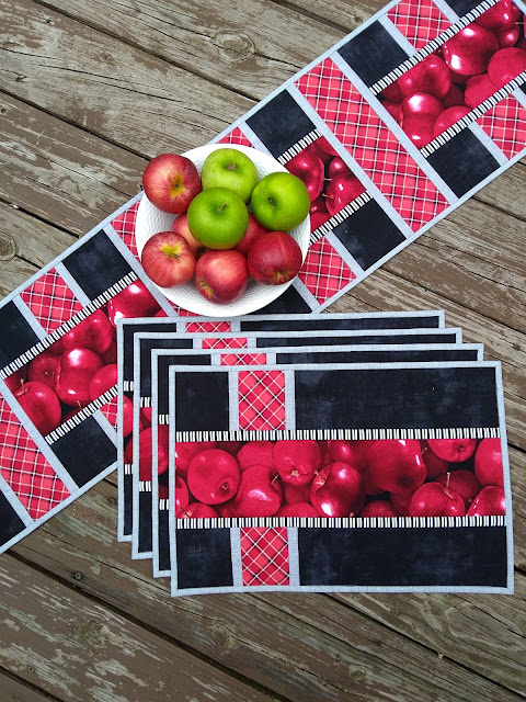
placemats and table runner with apple print, red, grey and black fabric
Fresh Wrapped placemats and runner by Canuck Quilter Designs

This is Fresh Wrapped.  That gorgeous apple print has been begging to come home with me for a long time, but I never had a purpose for it before.  I'd like to say I designed these placemats just for this fabric, but that would be stretching the truth.  I designed first, then I rooted through my stash to determine I really didn't have enough of any suitable print (my stash is mostly tone-on-tone colors), then I walked through the quilt store.  The apple print jumped right out and assured me there wouldn't be a better project to finally use it.

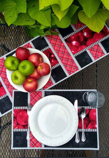
white plate and table setting on red, black and grey placemats with apple print fabric
Fresh Wrapped placemats by Canuck Quilter Designs

As in most of my placemats, the piecing is simple and you can see a bit of the design even when the table is set.  Why go to tall the trouble of piecing something fancy if it's just going to be covered up by a plate?  These are strip pieced so they are a easy and quick to assemble

Not related, but don't you just love how the green apples and the sweet potato vine in my flower boxes play so well together and help the reds pop?  I tried to photograph this set on my dining room table, but the colors just wouldn't turn out right inside, so I stepped out onto the deck to use overcast daylight for lighting.  Much better.

Pattern available here.

I'm a little sorry I had to get my pattern covers ready and sent out to distributors before I managed to take these photos.  The cover looks crisp, but at the same time the picture looks like a digital image rather than a photo of actual placemats.  It is a photo though. I used blue painter's tape on a blank wall to mark a box in the same proportions as the space on the pattern cover, so I could lay everything out to fill the cover space, then I taped the placemats and runner to the wall with green 3M painter's tape for hard-to-stick surfaces.

Photo setup for Fresh Wrapped placemats

I did the same thing for my new Flipped table set, but I'll just skip straight to the pretty styled pictures.

Flipped placemat and runner


All the angles in these Flipped placemats are made with the stitch-and-flip technique, so there are no triangles or odd shapes to cut, or cut bias edges to worry about.  They stitch up super quickly, and as you can see the plate doesn't hide the zig-zag design.  The runner is made with bonus HST units created while making the placemats.

Flipped placemats and runner by Canuck Quilter Designs


Next up in the placemat queue, I'm making a Halloween version of Fresh Wrapped.  I'd show you the fabric pull,  but it's in the dryer as I type.  I like to prewash my placemat fabrics, because I know the placemats will end up in the wash, and I like to minimize shrinking-induced wonkiness in the washed placemats.  Are you a pre-washer?  Always or just for certain projects?

As I said earlier, there are also plans for a fourth set.  That one will be yet another version of my Geese Across the Table pattern, in Northcott's Cafe Culture collection arriving in stores soon.  I'm not a coffee drinker, but I know people who are!   Here's an EQ8 peek at what the coffee-lover version will look like.

Mockup of Geese Across the Table in Cafe Culture


So, back to my placemat "problem". They're a quick way to get a "finish fix", to get that lovely feeling of finishing a project.  They are pretty but practical. They don't take as much room to store as a throw or bed quilt.  They're a great gift option for any occasion.  So, maybe it's not a problem after all!

Monday, September 6, 2021

Adventures in Quilt Photography Part 2

I remember shooting photos for my high school yearbook with a film camera, having to keep in mind the film budget, not knowing if the photos I took would actually be any good but also not wanting to waste film by just snapping away willy-nilly.  I'm so glad digital cameras came along!  I took over 100 pictures of my new quilts last week without any budget worries.  That doesn't mean I have 100 interesting or even 100 different shots.  As I took pictures with my phone camera, I looked at what I had just snapped, then took a new picture with minor changes I thought might improve the shot.


Being able to take a lot of shots has helped me recognize little things I can do to compose a better photo.  I still know squat about exposure but my composition is improving!

On Thursday I was limited to photos I could stage in my backyard.  The deck was my first location.  It needs a new coat of stain, but for my purposes, I'm just calling it "distressed for added textural interest".  Hmmm.  Right.  Well, I'm going with it anyway.

My first picture of Glacial was this one:


You can see the neighboring houses and firepit in the background.  That's rather distracting.  I could crop some of that out later, or I could sit down to take the picture and change the angle of the camera to just not have those things in the picture to begin with.  I adjusted the drape of the quilt a little as well. It bothered me that the blocks at the top were not quite in line with the railing, but close enough that it looked like that's what I had tried to do but messed up.  Picky, I know.  But I tweaked it anyway, so it looked deliberately askew.

I really liked this next one, with the wind blowing it out a little for extra movement and interest:


Before I could readjust to crop out the distractions, the wind helped out a little bit more and relocated the whole quilt.  It landed on Rosie.  You can see she wasn't impressed.


Since The quilt was on the decking now anyway, I spread it out there for a different layout.  Here's the area I was working with.


You can see I pushed a table out of the way.  There are a couple of chairs right behind my knees.  Of course, you have a lovely peek of the neighbour's house and garage as well.  Again, zooming in at just the right angle cuts out those distractions. It's too bad I cut off the corner!


At this point Rosie got a little bored.  I caught her in mid-yawn.  Not her best photo!


To change things up we headed to the back of the yard and tried some artful draping over a chair.


Not awful, but if anyone has any tips to share about artful draping, I'm all ears.

Finally, on the way back inside to grab the next quilt, I draped the quilt over the deck stairs railing.  Again, there were a few different attempts to straighten the quilt and crop out as many distractions as possible.


I think I could have cut out a little bit more of the eaves in the top right corner. And yes, this is the same quilt.  It's the "after quilt", "party in the quilt back", back of the quilt.  I had leftover bits to use up!

Next up will be placemats.  Spoiler:  I couldn't drape those over a railing...

In the meantime, Rosie insists I leave you with a more flattering picture than the two I shared above. 

Rosie inspecting one version of I Spy Lanterns


Visit my Etsy shop to get your copy of the Glacial or I Spy Lanterns patterns.

Friday, September 3, 2021

Adventures in quilt photography Part 1

How do you feel about quilt photography?  I have a love-hate relationship with it.  When my pictures turn out, I feel pretty enthusiastic about it.  When I can't seem to make the quilt look as good in the picture as it does in person,  my enthusiasm fades.  

Getting good photographs is rather important to market my patterns, so I have some incentive to work on my quilt photography skills.  With seven patterns to usher out into the world this week, I got some practice in over the last couple of weeks.  Despite buying studio lights and a tripod to use indoors, I struggle with taking good, evenly lit photos with accurate color, so I headed outside.  

Quilt with purple and green on a white background, with a lake and blue sky in the photo background.
Polarized by Canuck Quilter Designs


This was one of my successes last week. Can you believe how well the blue sky and water and that touch of greenery on the far shore match the quilt?  I took a small detour on my way to dropping my husband off at work and pressed him into service as quilt holder.  He was a good sport.  I'm sure his arms were tired by the time I got this shot, because a slight breeze was blowing and we had to wait for the quilt to drop flat between little gusts, and of course exactly as I pressed the shutter there came the breeze again.

This was actually Day 2 of the quilt photo shoot.  The day before we went out to a different park with an armful of quilts, planning to try flat shots for the covers, and styled shots because they're pretty.  I knew it was hot outside, but I didn't realize just how hot until I was walking through the park with a stack of quilts, with sweat stinging my eyes.  My enthusiasm took a nosedive, but my husband convinced me to try at least one flat shot of each quilt, because the pattern release deadline was looming and I had no pattern covers.


This is the best we managed for Polarized.  It looks pretty dingy and yellow, and my limited Photoshop skills could not rescue it.  I was so miserable while taking this miserable photo.  Thank goodness for a good night's sleep, slightly cooler temperatures and an accommodating quilt holder. The next morning I got a great picture in less than 10 minutes without risking heat exhaustion. 

We did have some success with other quilts on Day 1, after coming to grips with the idea of stepping out of the cooler shade.

Quilt with bright geometric design on a cream background, on a footbridge
Glacial by Canuck Quilter Designs

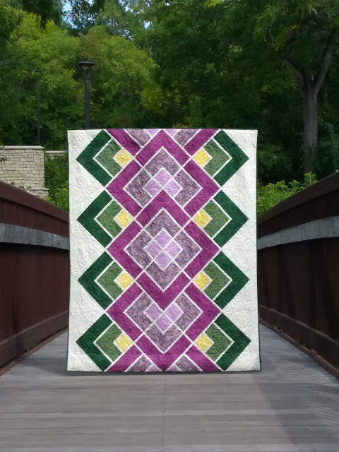
Purple and green geometric quilt on a footbridge
Modern Lace by Canuck Quilter Designs

Quilt featuring stacks of rectangles and a few accent stars, all in creams and grey on a black background
Stellar Stacks by Canuck Quilter Designs


Here's a peek at how I made the quilts hang mostly straight.

Pieced back of Polarized

I pinned hanging sleeves to the back of the quilt on both the top and bottom, and inserted a rod in each.  The top rod keeps the top edge of the quilt straight, and gives the quilt holder something other than the corners of the quilt to grip.  The bottom rod weighs down the quilt so it doesn't ripple and sway and flap around as much, and keeps that edge straight as well.  You could use any straight rod or dowel, but I bought two adjustable Hang-It Dang-It rods to use so I can easily adjust the length to fit whichever quilt I'm photographing.

The other important part of these photos is aiming the camera at the exact center of the quilt, and keeping the camera perfectly level.  If the camera is angled at all, there will be a "keystone" effect, where the quilt will appear narrower at one end than the other.  I'm getting pretty good at shooting straight, but I admit to using some editing software to square up the photo if it looks crooked on the pattern cover.

I used the sleeves and rods for this updated photo of Ripples Cubed as well.


You can see the quilt hangs much better than in my original "hold it by the corners" picture:


Besides the flat shots for the pattern cover, which are not optional, I like to have a few prettily styled, photos as well.  I didn't attempt those until the outside temperature was less oppressive, and I haven't finished sorting through them yet.  I'll share some of those photos soon.

In the meantime, I'd love to hear about your own quilt photography challenges and successes, and any tips and tricks.

Patterns for the quilts above are now available as PDF downloads in my Etsy shop, or ask your favourite quilt shop to order print copies.