Saturday, April 5, 2025

Spring Flowers, quilty versions

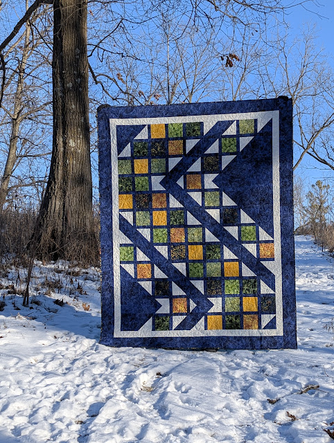
It's a  beautiful spring day here.  The blue skies and blooming daffodils are inspiring me to pull out some garden-inspired quilts.  I thought you might enjoy a round-up of my collection.

Prairie Mix

I'm not sure what I love more in Prairie Mix:  the fun little flower blocks, the pieced yellow pointy border accent, or the red and white dot border fabric.

Prairie Mix by canuck Quilter Designs made in 2020


Despite the assorted shapes in this quilt, I only had to cut and sew squares  and rectangles.  Thanks to stitch-and-flip corners, I didn't have to deal with a single individual triangle. You can read more about the making of this quilt here and see more pictures in this post.


Prairie Mix block

Sweet Trails

I love a twist on a classic block.  Sweet Trails extends the snail's trail block to turn the mollusc into a flower.  Snails are fine, but I like flowers more :)


Sweet Trails by Canuck Quilter Designs made in June 2023
with Island Batik's Heavy Metal collection


I couldn't avoid cutting and working with triangles for this one, but they were worth it.  I did make a lot of test blocks to test cutting sizes and trimming measurements to choose the most consistent method for the patternRead more about the block and the pattern.


I need to finish some these and make a few more for another quilt.

Sun Seekers

This is a scaled down version of Sew Kind Of Wonderful's pattern Soak Up the Sun.  I didn't want to sew as many curves as the original required, and I wanted to use up a pile of neutral scraps, so I filled the background with scraps squares and made just 3 sunflower blocks.  I addded prairie point embellishments in the border, just because I could and they seemed like fun.  You can see Rosie liked this one.


The Rosie picture is more fun, but here's a beter view of the whole quilt.


Sun Seekers finished in 2020
Block design by Sew Kind of Wonderful

Fabulous Phlox

This one's brand new!  I need to give it a post all its own.  I'll add that to my list :)


Fabulous Phlox by Canuck Quilter Designs
made with with Island Batik's Everlasting collection


I made this one for Island Batik's Spring 2025 catalog that was just released.  They sent me fabrics from their new collection Everlasting.   When I first drew this, I almost discarded the idea because of all the HST, but making them with triangle papers (template included in pattern) made them quick and easy.  I love that there were no sashing and no borders to fiddle with.  The layout is juts blocks on point.

I think it's lovely on a light background too, though I've only mocked up, not sewn, that version.


Fabulous Phlox design by Canuck Quilter Designs
mocked up in Island Batik's Everlasting collection
.

Focus Squared

This one isn't inherently a flower design, but I used a floral fabric as the focus print.


Focus Squared by Canuck Quilter Designs


I just love that hydrangea print. I'm sorry I don't have any information about it.  It's several years old so I'm not sure you could find this exact rpint now anyway, but I'm sure there's something equally pretty available now.  This is a great flower-themed quilt without the extra effort of piecing or appliqueing flower blocks.  

That's all the flower qulits I've pulled out of storage for now.  Do you have a favourite flower quilt?  I've seen some really lovely ones online.  Which have you made?

Happy quilting,

Joanne

Wednesday, April 2, 2025

Making QST from HST

 A QST unit is a quarter-square-triangle square, a square made up of 4 triangles.


Traditionally, it's made with 4 individually cut triangles, each triangle one quarter of a square, with the straight grain of fabric on the long side of each triangle.  This involves sewing on the bias, which can invite stretching and distortion.

In this tutorial I'll share how to make QST without cutting individual triangles or sewing bias edges.

Let's agree on a couple of definitions before we start.  
  • The finished size of a unit is the size of a unit after it is sewn to other parts of the quilt, with the seam allowances taken in by the seams.
  • The unfinished size includes 1/4" extra on all sides for seam allowances.
 For example, an unfinished 4 1/2" unit will be 4" finished in the quilt.

Please note that I prefer to make units a touch oversized then trim down to exact size and perfect shape.  This is more forgiving of slight variations in sewing.  The measurements I share will reflect that.

*************************


HOW TO MAKE QST UNITS


Step 1.  Choose four fabric squares, each 1.5" larger than the desired finished QST size.  This is enough to make four QST units.

Step 2.  Referring to this tutorial and the notes below make 2 HST, trimming them to 1" larger than the desired finished QST size. 
  • Refer to the diagram below to see how to distribute the 4 fabrics between the HST to get the desired fabric distribution in the final QST.
  • The four squares you started with will yield two HST1 and two HST2.  You'll use one of each to make one pair of matching QST.
  • Press either towards Fabric 1 in HST1 and towards Fabric 4 in HST2, OR away from Fabric 1 and away from Fabric 4


These are the two HST I will be working with.


Step 3:  Draw a line, diagonally from corner to corner and perpendicular to the seam line, across the back of one HST.   This will be a guide for sewing in step 5.
  • If you do not have an accurate 1/4" guide on your sewing machine or presser foot, you may prefer to draw guide lines on either side of the diagonal, 1/4" away from the diagonal, as I do below.

Step 4:  Layer HST1 over HST2, right sides together and with seam allowances in opposite directions.  


If you have pressed in the directions specified in Step 2, the fabrics should fall in the right order.  You can check by folding HST1 back lightly along the drawn line to preview the QST.  


Step 5:  Making sure the seams are butted up tightly next to each other, sew 1/4" on each side of the diagonal, across the existing seams.


Step 6:  Cut between the sewn lines to separate into two units.


Step 7:  As you press a unit open, spin the seam allowance to reduce bulk in the center.  The second half of this tutorial explains how to spin seams.  Alternatively, press seams open or to one side.


Step 8:  Carefully trim the QST unit 1/2" larger than the desired finished size, keeping all the seams intersecting the corners of the unit.
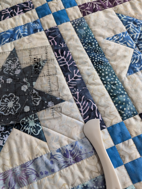
  • Position the rotary cutting ruler over the unit, shifting the ruler as needed until the markings for the size you need intersect seams in all three corners and the a corner of the ruler intersects the last corner of the unit.  
  • The  example below shows trimming to a 4" square.  The points circles in red highlight the measurements. Please note that I have exaggerated the amount of fabric to trim away in the example below so that you can see the intersection points more clearly.  Using the measurements in this tutorial, you would need to trim away less than 1/8" on any side.
    • A:  The diagonal seam bisects the corner of the ruler.
    • B:  The 4" mark along the top edge of the ruler meets the diagonal seam.
    • C:  The horizontal and vertical 4" measurements lines intersect over the diagonal seam.
    • D:  The 4" mark down the side of the ruler meets the diagonal seam.


Step 8:  Trim away the excess fabric at the top and right side.


Step 10:  Turn the unit 180 degrees and position the ruler so the required measurements are flush with the two sides you trimmed in the last step.  In this example, the 4" vertical and horizontal measurements are flush with the previously trimmed  edges.


Step 11:  Trim the excess fabric at the top and side.


The QST unit is now complete.  Remember, it includes 1/4" seam allowance on all sides, so it will be 1/2" smaller once it is sewn into the quilt.

*************************

For quick reference, here's a summary of relevant measurements:
  • Starting squares:  finished QST size + 1.5"
  • HST trimmed size:  finished QST size + 1"
  • QST trimmed size:  finished QST size + 0.5"

For example, for a 4" finished QST:
  • Starting squares: 4" + 1.5" = 5.5"
  • Trim HST to: 4" + 1" = 5"
  • Trim QST to: 4" + 0.5" = 4.5"
*************************

I hope you have found this useful.  Please share in the comments if you have any tips and tricks for making QST.

Happy quilting,
Joanne

Monday, March 3, 2025

Viewing fabric selection in grayscale

As I was reminded when I was testing my Sparks pattern over a year ago, contrast between colours is not necessarily the same as contrast between values.  I'll show you why it matters, then one method to check value with a phone camera.

Why it Value Matters

A 2 x 2 grid of yellow, red, orange and tan fabrics beside a 2 x 2 grid of the same fabric viewed in grayscale, showing as light, dar, medium and light, respectively.
Colour versus Value

You can definitely see four distinct colours in the photo on the left.  There is contrast between all the colours.

The picture on the right is the same picture viewed through a grayscale filter to show value instead of colour.  It looks almost like there are only three different fabrics rather than four.  The yellow and tan both appear light in value, while the orange and red are medium dark and dark.  There is much less contrast between the two fabrics on the left.  

Why does this matter?  Despite seeing the colors clearly, when these fabrics are used together there will be much less contrast between the yellow and tan than between the red or orange and the tan.  This is not inherently a problem. If you don't need the same strength of contrast, it's fine.  However if you need the contrast between the yellow and tan to have the same strength as the contrast between the tan and the other fabrics, this will be a disappointing collection.

You can see how the difference in the strength of the contrast affects the design.  While the block design is clear in the orange and red, it fades away in the yellow because there isn't enough contrast between the yellow and the tan background.  

I rearranged the fabrics to balance areas of high contrast and lower contrast to rescue most of the blocks in this quilt.


How to check value using a phone camera

I'll demonstrate using my new fabric selection for the Colour Value Mystery Quilt-Along (QAL).  You can read my previous post about how I had to tweak my original selection because of two fabrics being more similar than I had thought.  

The pictures here are screenshots of the camera app on my Pixel phone.  Your phone may be different, but hopefully you can figure out the equivalent steps for your phone app.  If you're lucky, you might even be able to adjust a setting on your phone to just view everything in grayscale from the start.  My old phone had this feature and I miss it!  If you have Pixel phone and know how to turn that on, please let me know!

Step 1.  Take a photo of the fabric, arranged from lightest to darkest. (Note the black strip at the top of these images is the top of the phone screen, not one of the fabrics!)

Screenshot of a phone camera screen  The thumbnail of the most recently taken photo, to the left of the shutter button, is circled in red.

Step 2: Click on the thumbnail image of the photo, circled in red above, which will take you to the screen below.


Step 3
:  Click on the Edit button, circled in red above.  That will take you to the screen below.  The area circled in red has various tool options to choose from.  Swipe left until you find the Filter option.  When that option is highlighted you'll see smal versions of your photo with various filters, right above the toolbar.  


Step 4: Swipe left through the versions of the photo until you find the Onyx filter.


Step 5:  Click on Onyx.  You'll see the photo with the grayscale filter applied.


Step 6:  You can click on Save a copy if you'd like to save the grayscale version to review the results later.

Here's my fabric selection, from lightest at the top to darkest at the bottom.  


I hope you find this useful!

Happy fabric pulling!

Joanne

PS:  There's  still time to join the free Colour Value Quilt-Along!  Click here to go register.

Wednesday, February 26, 2025

Revising my Mystery QAL fabric selection

I'm hosting a mystery quilt-along again this year.  Though I'm doubling the number of fabrics to four this time, I still want the colour selection to be fairly easy despite participants not knowing what the quilt will look like in the end.  

I chose a design that hinges on having 4 different colour values:  dark, medium-dark, medium and light.  I chose blues for the three darkest fabrics and a light on white print for the lightest.  These digital swatches of Island Batik foundations looked pretty good together.

From left to right:  Island Batik Foundations Marine, French Blue, Chambray and Glaze

I ordered my fabric, spent some time setting up the technical behind-the-scenes parts of the QAL, then squealed with delight when the fabric arrived and the colours were just as gorgoeus as I had hoped.

If I was so delighted, you ask, why am I revising my fabric selection?   Well, part of the beauty of batiks is that they are handmade and each bolt will have some variations.  Usually I love the interest that colour variations add to the quilt.  This time, there was a problem.

When the fabric arrived, I stacked the pieces togethher and saw the strong contrast between each of the fabric, just as I needed.  Today I unfolded the fabric to take some pictures and found this:

Where did my dark fabric go?????

The fabric has different shades of blue through it. I was expecting more of the dark navy you see in the upper right in the photo above, with just a small amount of the lighter blue for texture.  That's what I saw when I first saw the fabric.  When I unfolded it, there were larger patches of the light blue that blended very, very well with my medium-dark fabric.  That's not going to work.  I need strong contrast for this design.

Folks, this is reminder that nothing beats seeing a fabric in person before you buy if you have the option!  This afternoon I trotted off to my local quilt shop to see if I coud find a substitute dark batik.  Yes, I should have shopped there first and not only seen my fabrics before I bought, but also supported my local shop so they can stay in business so I can run there the next time I have a fabric emergency.

Thankfully, I found a dark that I think works.  It's Indigo Vines by Lunn Studios from Artisan Batiks: Kasuri.  I hadn't planned on using a print, but I think it will be OK.  In fact, I think that little bit of print will add a little extra interest to the quilt. 


I can't wait to get started on these quilts.  Yes. Quilts, plural.  Depending where you use the different colour values in the design, you'll get either a slighly traditional or a slightly modern quilt.  I just couldn't pick so I'm making both :)

The free Colour Value Mystery QAL will launch on March 13th and all clues (instructions) will be sent by email every Thursday for 8 weeks.  Registration will open this Friday, February 28th.  If you're on my mailing list, you'll get an email with the link.  I'll also share on Facebook and Instagram, and add a link to the right sidebar of this blog.  After registering, you'll receive an email with the fabric requirements for either version in a choice of 5 sizes, baby through king.  I hope you'll join me!

Happy quilting,

Joanne

Saturday, February 22, 2025

Manor Garden

 Manor Garden is one of my favourite recent designs. It looks more complex to piece than it actually is.

Quilt made of 12 blocks in various greens and brown, against a green woodland backdrop.
Manor Garden by Canuck Quilter Designs
Made with Whispering Woods from Island Batik

As many of my designs do, it hinges on stitch-and-flip corners to build shapes without having to cut triangles or templates. 

Corner of a green and brown quilt, draped over a large tree stump
Closeup of  Manor Garden by Canuck Quilter Designs
Made with Whispering Woods from Island Batik

The design reminded me of paths in a formal garden. Formal Gardens was already taken, so I had to stretch just a tiny bit for the pattern name.

Manor Garden quilt, a brown and green qulit with cream accents, draped over a wooden bridge railinf agains a green leafy background.
Manor Garden by Canuck Quilter Designs
Made with Whispering Woods from Island Batik

The Whispering Woods collection from Island Batik is inspired by woods more than a garden, but the nature theme still worked quite nicely.  Here's my selection of 12 fabrics plus a basic foundation, Sugar, for the accent/sashing.  The Sugar has more golden tones that it seems in this photo.


You could also choose to repeat fabrics.


In this mockup I used only 6 instead of 12 fabrics of the Forest Flora collection, also from Island Batik. I also used the accent fabric for the border to lighten up the designs.  There are so many choices you can make to create a quilt different than the cover quilt!  

(Did you know I offer a whole Zoom presentation all about how to think beyond the pattern cover?  Your guild program chair can find out more about this and other lecture offerings here.)

One more picture, just because...


...I want to acknowledge and thank my husband for being such an accommodating quilt holder.  He deals with the wind yet never drops a quilt, holds on for "just one more" shot, and happily traipses through the park with quilts in tow.  It was particulalrly buggy the day we took these photos last summer, which deserves an extra thank you!

Today is less pleasant outside than last summer, though it is sunny at least and not as cold as earlier this week.  Still, I'm hunkered down in my sewing/design space, mulling over new designs and doing the last little bit of planning for my next mystery quiltalong starting on March 13th.  More info and signups for that coming this week!

Happy quilting,
Joanne

Tuesday, February 11, 2025

Why I needed skinny little binding

 Here's my new Brochettes sample for an improved pattern cover.

Brochettes placemats and runner by Canuck Quilter Designs

I love my original sample.  I'm very happy with how it looks in person, but some quilt projects just don't work well in a small thumbnail image of a pattern cover.  This was one of those so I needed a new version.

You're probably wondering what this has to do with skinny little binding.  Well, maybe you aren't wondering, but I would be. Here's a hint:

Mini versions of a Brochette placemat and runner

Isn't it fun how the lack of context messes with our perception of the size of something?  With the mug added, you can see that these are not the full size placemats and runner you'd get if you followed the pattern. These mini versions used pieces that finish at half the size the pattern calls for, which resulted in placemats and a runner that are one quarter the size of the original. 

But why?  Why make minis?  When I looked through my stash for a new colour combo for the new sample, these fabrics jumped out.  They are Heavy Metal batiks from Island Batik's Fall/Winter 2023 collections and I only had scraps left.  There wasn't enough for a full size placemat and runner, but once I envisioned them in this colour combo I couldn't unsee them.  The rest of my stash just did not measure up!  I did some math and was thrilled to see I could manage a mini version.  As long as I kept everything to scale and photographed the set without anything else to hint at the actual size nobody would have to know!

Quilting the mini placemat, thinking it was super cute before I realized
a regular binding would be weirdly wide in comparison


That's where the skinny little binding come in.  When I came up with the grand plan to make these mini tricksters, I forgot about the binding.  The usual 1/4 inch binding sewn to these smaller versions would look  very odd.  It would either clue people in that these are actually smaller, or it would look like wierdly wide binding.  To match the scale of the placemat, the binding would have to finich at 1/8" wide.

Ha!  I could make 1/8" binding!  I thought I could just add binding with a 1/4" seam allowance as usual (because that would be easier than sewing with an 1/8" allowance right?) them I could trim off some of the seam allowance to make it skinnier before I folded the binding to the back.  Ooops, I forgot about the pesky corners.  Stitching goes all the way to the edge of the seam allowance at the coner, so trimming away the seam allowance there involved some ripping and...you know what?  You don't need the details.  It was a bad idea.

Anyhow, after much ripping and trimming and finagling, I was able to stitch the binding to the back, stitching in the ditch from the front and catching binding on the back.  


1/8" binding looking so tiny and delicate


It looks pretty good on the straight bits, but I'm not showing you a close-up of the corners.  They're a bit gnarly up close, but you can't see that at pattern cover photo size, so they'll do.

Before binding the runner I Googled a bit to see if I could find tips for making mini binding, but all I could find were tips on adding 1/4" binding to tiny quilts.  I quite definitely wanted 1/8" binding.  The one thing I took away from my search was that single fold binding would be better.  One tutorial I found added the binding fabric as though adding a border.  I thought that seemed like a good idea.  It ceratinly made trimming the seam allowance easier.  The method also didn't give a mitered corner, but I would have been OK with that.  I was looking for tidy, mitered or not.  Well, at the scale I was working with, seams were getting in the way and it didn't work.  I finally figured out a method that controlled the bullk in the corners, but the last corner was a bit of a mess no matter what I did.  So, in short, I can't share a good method with you.  I'm not sure I want to keep experimenting with this, but if I do make a mini again and experiment with super skinny binding again, and come up with some good tips, I'll let you know. 

I'm still really happy with my little minis.  I think they're super cute, and they'll dress up a small table quite nicely.  My coffee addicted hubby wants the placemat mini for a mug rug.

I'm also quite pleased with the new pattern cover.  The original one is on the left.  I think you can see the design so much more clearly on the new cover.  I feel better about submitting this to distributors now, so hopefully you may see this pattern in shops soon.  Until then you can get a PDF download version in my Etsy shop.

Original and revised pattern covers for Brochettes


Next up, I'm going back to normal scale sewing !  Patchwork Wishes now has borders and is waiting for quilting.  I have regular 2 1/4" double fold binding ready and waiting for a an easy 1/4" binding! That said, if you have tips on making mini binding, send them my way in case I lose my mind again and try another mini :)

Happy quilting,

Joanne

Friday, February 7, 2025

Shimmering Tiles

 I love an on-point quilt setting, and I love not having to fuss with long sashing strips.  Shimmering Tiles checks off both!

Shimmering Tiles by Canuck Quilter Designs made with fabrics from
Island Batik's Essence collection

I love a design that looks complex but is in fact simple to construct.  Shimmering Tiles looks like it could have Y-seams, but it doesn't.  It has triangles, but thanks to stitch-and-flip you only cut and sew squares.  Well, only squares with the exception of the setting triangles to set everything on point.  On point settings are not difficult, I promise!

Shimmering Tiles by Canuck Quilter Designs made with fabrics from
Island Batik's Essence collection

This version was made with Island Batik's pretty Essence collection, which is shipping to stores soon. 

Batiks from Island Batik's Essence collection

Though I chose only aquas for this design, the collection also includes some purples and spring greens.  There's alot of potential there!

Essence fabric collection from Island Batik

While Island Batik selected this version for their catalog, I also mocked it up in two other collections from their Fall/Winter 2024 catalog.

Shimmering Tiles by Canuck Quilter Designs mocked up in fabrics from
Island Batik's Autumn Twilight collection 

Shimmering Tiles by Canuck Quilter Designs mocked up in fabrics from
Island Batik's Radiant Burst collection 


I'd love to remake the quilt in each of these collections, but there are only so many hours in a day, so I only get to recolor them in EQ.

What colors would you choose?

Happy quilting,

Joanne